Fonalgubanc - webshop design and UX analysis

It all started when Kati, the owner, contacted me saying that she had bought a hosting space and wanted to create a webshop where she could sell her beautiful handmade products.

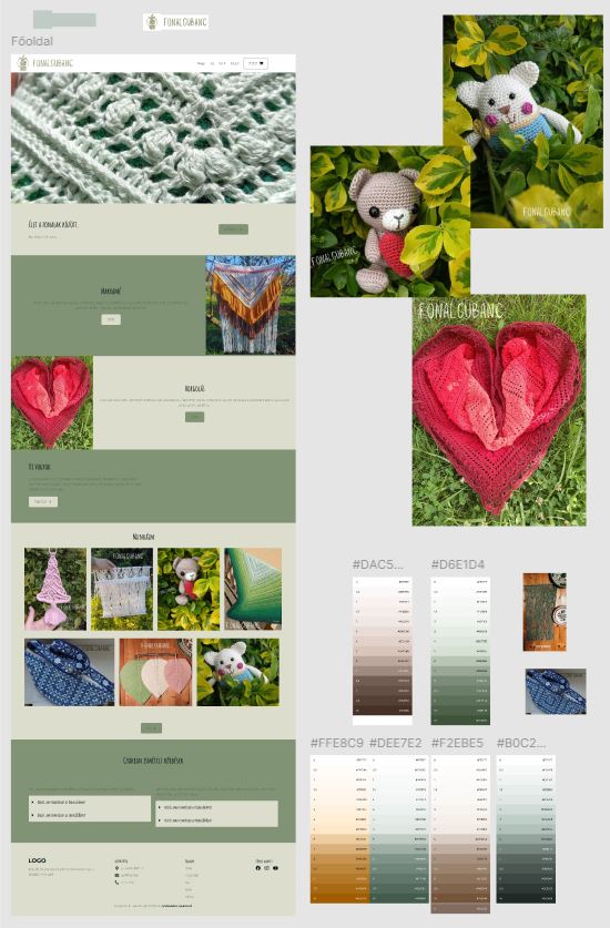
She told me her ideas, what colors she wanted and what she wanted to include on the site.

The goal was to create a webshop that was beautiful, understandable and easy to use for visitors.

It was especially important to me that the webshop reflect Kati’s ideas, and that the user experience was also consciously designed.


Tools used for the webshop

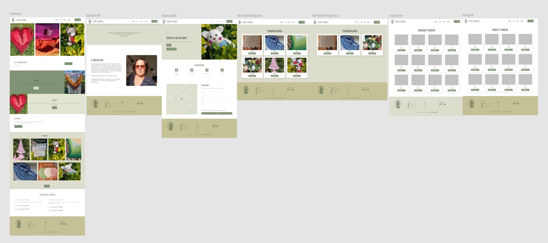
I used Figma to design Tonaltangbanc, then built it in WordPress with Elementor and Woocommerce, and used Canva for the images.

Woo_logo_color

As a first job, building a webshop was a very exciting challenge, how to turn an idea into an understandable webshop, or how to present a product in a way that is clear and understandable. I also had to pay attention to how to avoid confusing the visitor, how to provide them with the most confident website usage and shopping experience. Finally, it was also an important question how to coordinate the owner’s vision with the user.

How did I work?

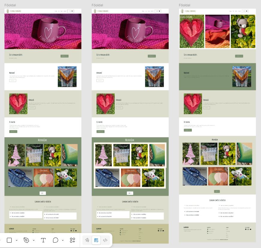
I consulted with Kati a lot. Whenever she came up with an idea, she would send it to me, and I would think about how good it was, make prototypes and samples so that I could visualize her idea for her, to see if she really wanted it that way, would she like it in person?

Finally, the big picture came together from the many mosaics.

And the final look:

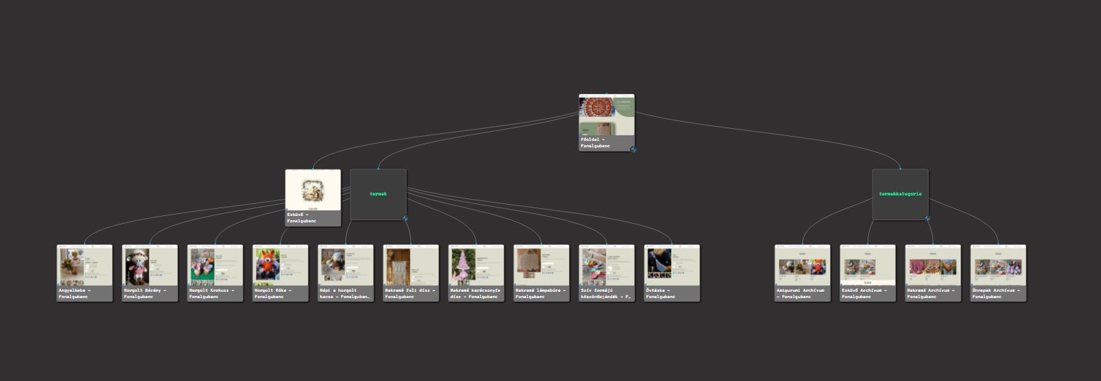
After choosing the colors and images, and figuring out the structure of the site, I focused on how it would be user-friendly, how the webshop could be transparent yet engaging, kind, and in keeping with Kati’s style.

Start

Final result