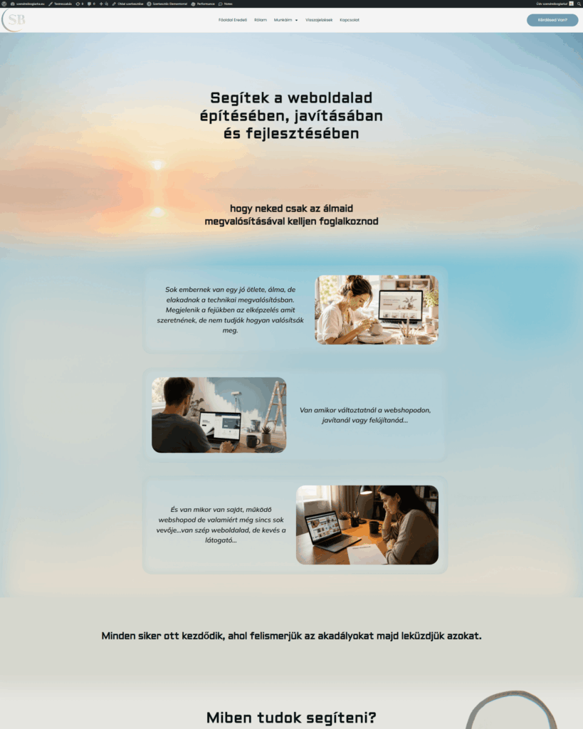
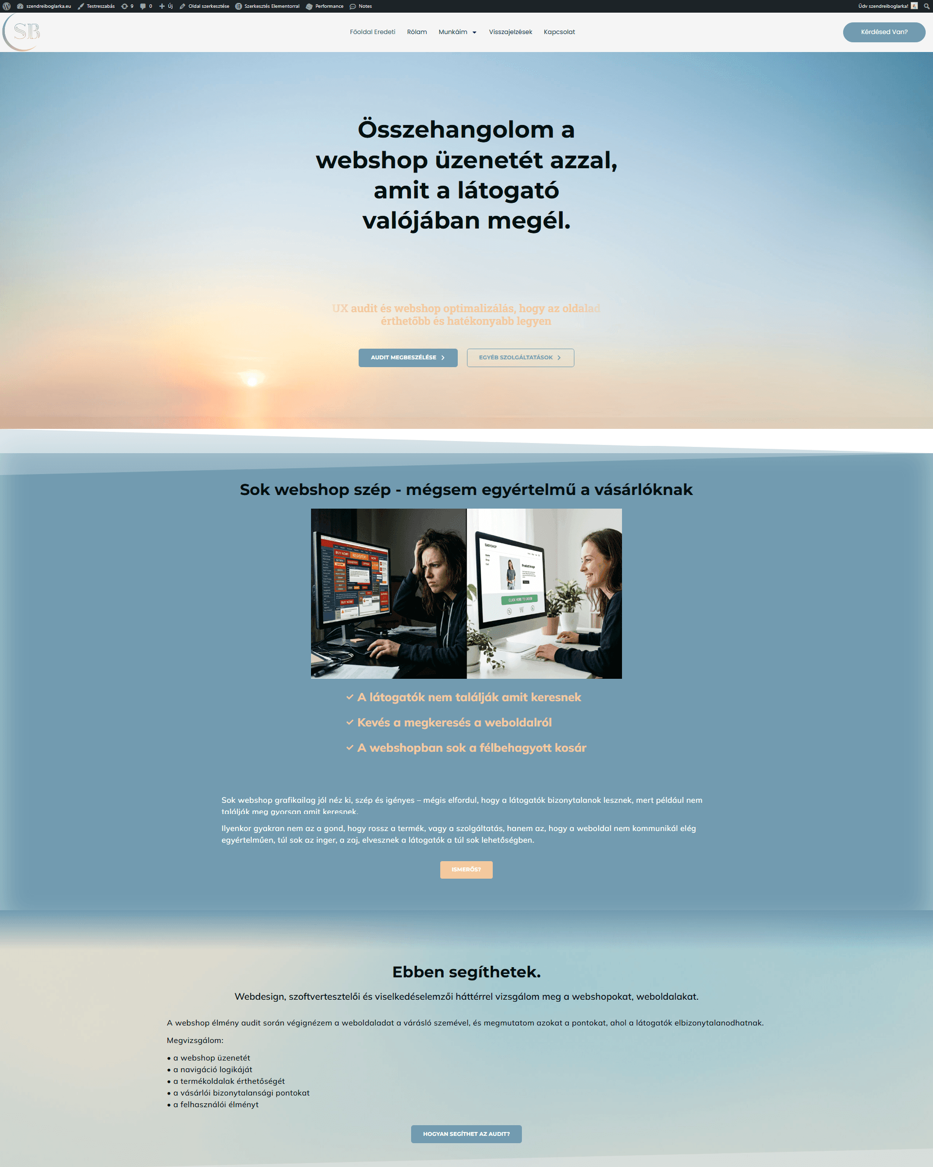
My website

Structure and UX analysis

I'm a web designer. And a UX designer. With a background in psychology. I needed a website where I could showcase what I know.

My goal was to create an easy-to-use, clean website. Where everyone can find what they're looking for right away. Where there aren't many distracting factors that cause cognitive load.

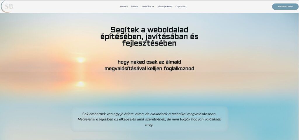
First, I thought about the mood, message, and colors of the site. I was looking for soothing, pastel colors.

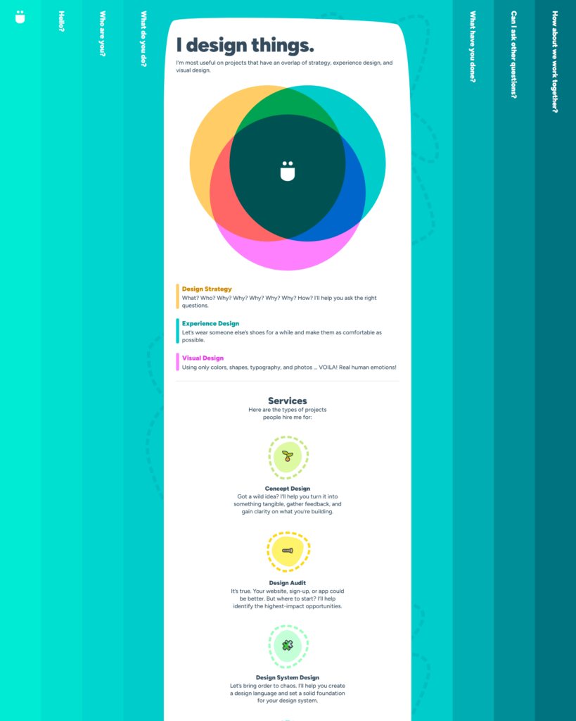
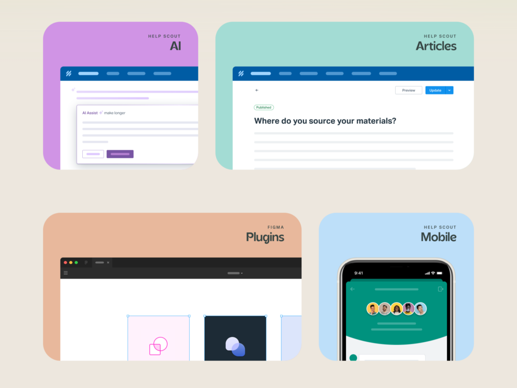
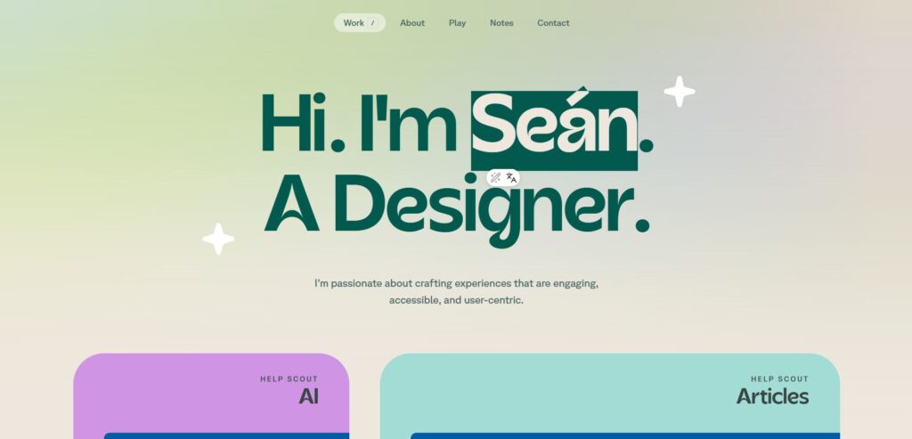
Competitive analysis: I looked at other web designers to see how they presented themselves and their skills. In the field of web design, the range is very diverse, different and colorful. Some are playful (https://bruno-simon.com/ or http://rleonardi.com/ ) fabulous (https://denisechandler.com/#about ) or simple, clean (https://www.seanhalpin.xyz/ ) . I also looked at the websites of my role models. They are Sean Halpin and John Henry Müller (https://johnhenrymuller.com/#craft)

Early in the design process, I looked for interfaces that combined minimalism with a direct, friendly feel. My biggest inspiration was the work of Sean Halpin. His spacing and clean card structures showed me how to make a portfolio look professional and relatable at the same time.

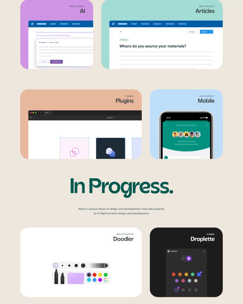
While Sean uses soft, pastel greens, I chose nature’s shades of blue for my own brand.

The biggest challenge was how to design a UX professional website that was both personal and professional at the same time. Both human and IT.

It was important that the website:

remain transparent
be easy to navigate and understand
yet convey professionalism
and be more personal and direct.

Eszközök

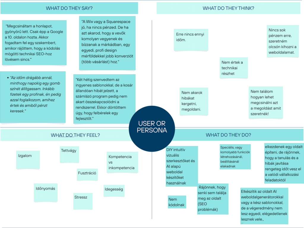
Empathy map

First I used an empathy map.

Based on the posts, opinions, and comments on the internet, I assessed what people who want to have their own website say, think, feel, and do.

One sentence summary from the users’ perspective:

As a small business owner/individual, I want a website/webshop that allows me to realize my dream, business, and earn money or build a career.

Users’ goal: To create or improve a website/webshop. (The improvement can be physical or through analysis)

Limitations:

  • time
  • technical knowledge
  • they cannot set up or create more complex, special functions on DIY intuitive pages or with AI generators.
  • It will be similar, templated.
  • Without SEO, no one will find the website.
  • Price

Success = In a short time, cheaply, without debugging, only dealing with the content and appearance, creating a working page with special functions that can be easily found on the Internet.

How does my product meet the needs?

In my case, UX analysis and website/webshop building are the services that need to meet the needs of the users.

User needs:

your website can be realized.

The benefits and values ​​I can offer:

Specific value proposition:

Creating and redesigning websites and webshops, at a human price, reviewed from a UX perspective, so that the site is not cognitively, attention-demanding or frustrating. Easy-to-use navigation, a good experience for the user to use the website. SEO settings so that it is easily searchable on the internet.

The process

1

the first plans were not yet so clear

2

but I tried to refine it, shape it...

3

still had to be shaped

4

Finally

Beginnings

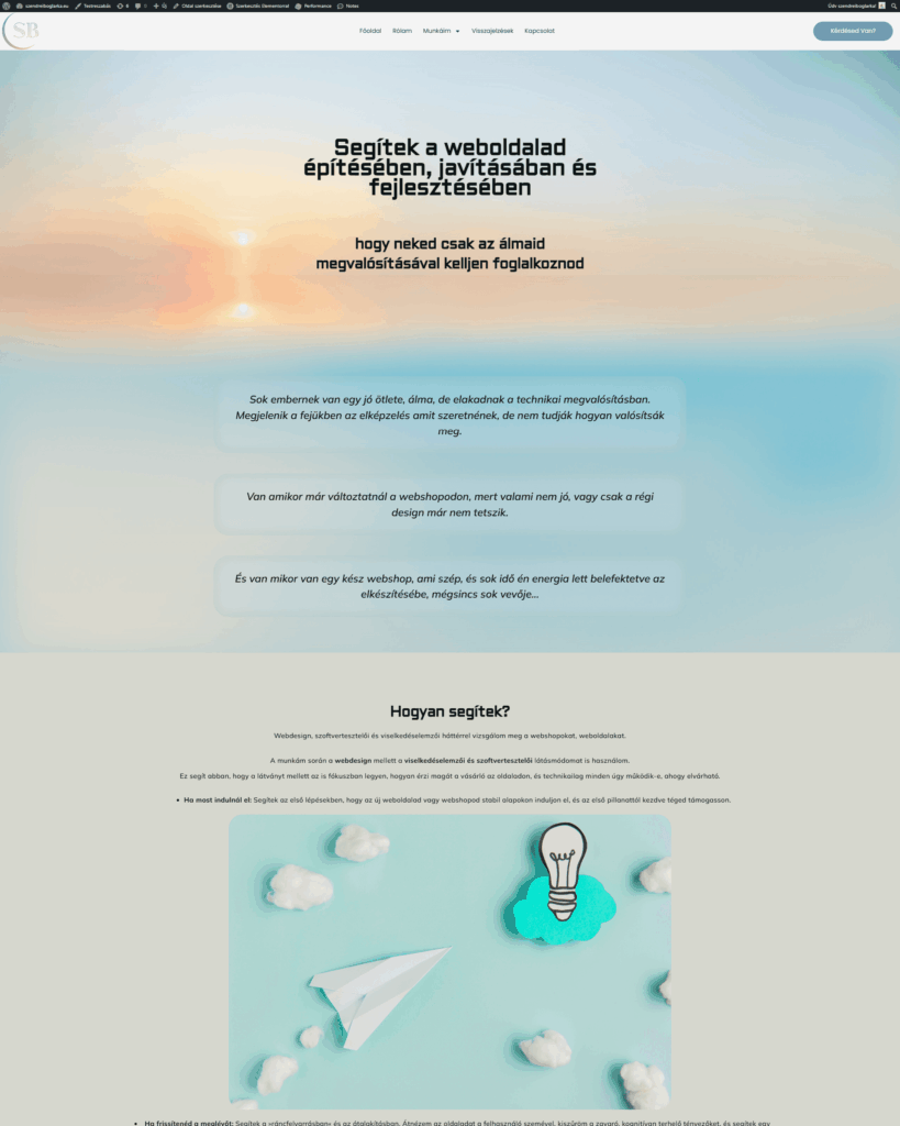
The first plans were not yet so clear.

Then

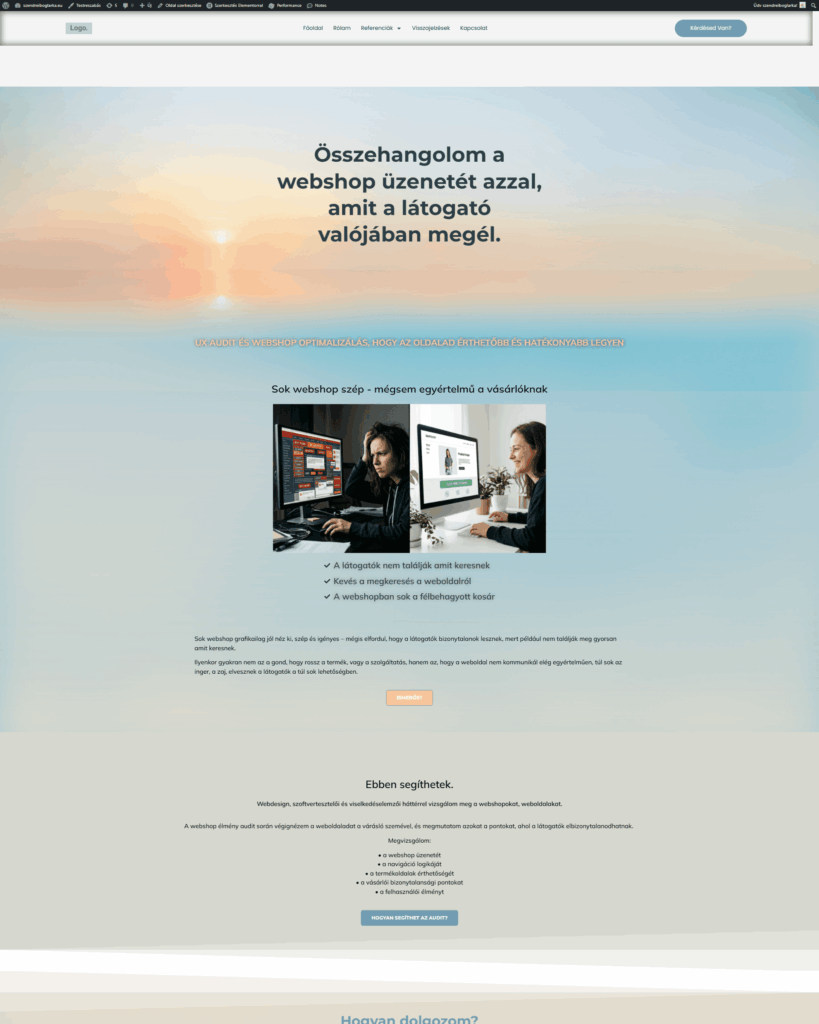
I tried to refine, shape

And

it had to be modified because it wasn't what i want.

Finally

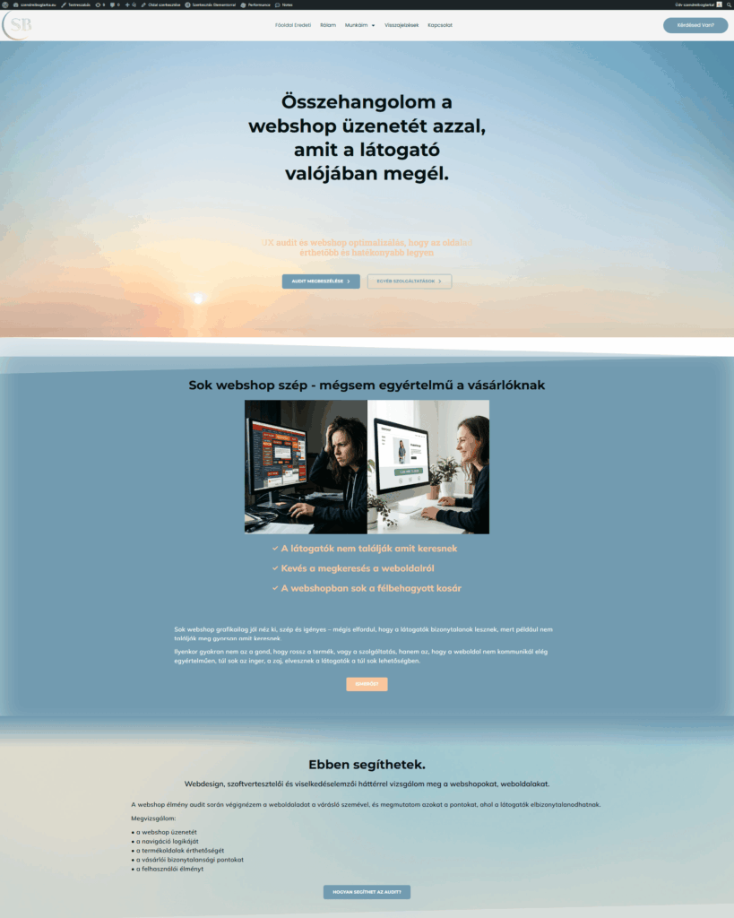
the result

This is where I am now.

But this is not the end. I will definitely continue to improve the site in the future, as my knowledge changes, the site will also develop. I am currently taking the Google Coursera web designer course and I will post my portfolio of work here.